The Film Artwork of Paul Shipper - Ape On The Moon
I’ve chosen to interview a very talented illustrator with a traditional illustration style. Admittedly, on a contemporary illustration blog, this is somewhat an illegal undertaking according to my own rules. However, I am very supportive of the use of traditional techniques used by Paul Shipper, in contemporary movie art. Originally from the UK, now based in New Zealand, Paul is adamant that traditional styles still be used on film posters, and I would agree, especially in the case of certain epics, science fiction and fantasy films, promotional material, and so on.
His work style is also particularly relevant in the contemporary illustration world that is seeing an increasing divergence away from digital media. I asked him a few questions about his illustration background, technique and current plans.
How did you get into the illustration you do?
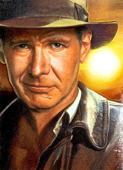
When I was young, I spent a lot of time drawing. I would get posters from the local video shop to adorn my bedroom walls. I loved the art on the posters. I studied them and redrew my own versions in my scrapbooks. After years of collecting posters, I realized that 90% of the posters had the same signature on them. It was of course Drew Struzan. This was the point I realised that a job like this could exist, that you could get paid to create works of art to promote film, and I found my dream to follow.
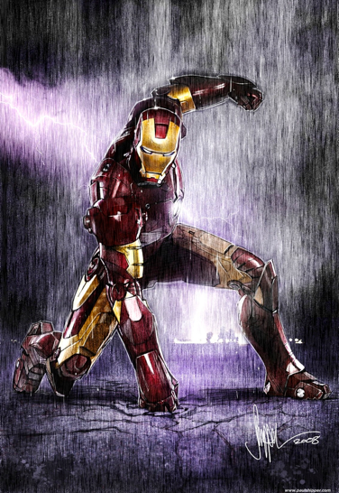
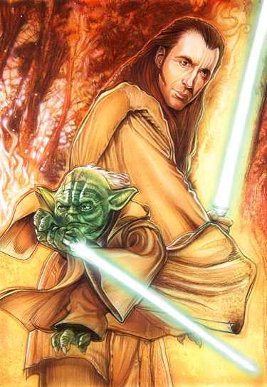
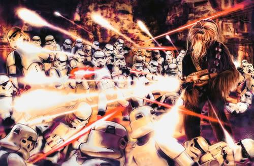
I will be the first to admit I am not there yet. My dream lives on despite technological shifts and changes in peoples perception of the modern film poster. I am still holding fast to my original dream of creating traditional illustrated key art for film campaigns. During my quest I have had the opportunity to work with some great clients includingPenguin Books NYC, Sports illustrated, GQ magazine, Topps inc. In 2007 on the 30th anniversary of Star Wars I received my first official Star Wars work from Lucasfilm.
What kind of training do you have?
I have a BA in illustration and animation. Three years of tutors attempting to alter my due course. I am such a stubborn cat at times. especially when it comes to my aspirations and dreams.
My training really came from years of drawing and painting, studying the works of my inspiration, and sheer determination to making a dream become reality.
Can you explain your work process and the tools you use?
Once a job comes through it all starts with some research on the subject. This includes sourcing reference to work be it from the clients specifications or self generated reference.
The next stage involves brainstorming ideas. I sketch and think about it a lot. Ideas will come when least expected. Once I have settled on a concept I begin sketching it out. It can be a fast process, very rough outlines regarding the content of the illustration. The compositional ideas. Once I have settled on a concept, I sit down to the computer and Photoshop. This is where I really start to compose my work. Using my gathered reference files and sketches, they are imported into Photoshop, moved around and re-sized. I play with colour ideas using my original sketch outlines as a reference . This process can be quite labour intensive but it is the best way that I have found for creative composition in my work flow.
A lot of the time this rough digital comp is not that rough at all and some would argue that it is a finished piece of work. Occasionally if the project supports it a pencil rough is submitted based on the digital comp. My roughs are submitted to the client for approval of composition, colour concept and content. When I hear from the client I will usually be required to make some adjustments. I have been known to get the go ahead from my first rough concepts. All feedback is taken on board and more comps are sent for signing off.
When the all clear is given from the client it is time to prepare for the final illustration. Crescent illustration board is primed with Gesso. Usually slapped on to create textures on the board that is relative to the job at hand . I hate it to be too smooth. I want the brush strokes to really show through in the finished art.
A print of the approved rough is created and placed in my projector. This part of the process gets some flak from people who really don’t understand the process. They think you are cheating in some capacity. The reality of it is that the image you get on your artboard really isn’t good enough to ‘trace’ verbatim. It just gives me a chance to outline where the content of the picture resides. An outline of a head perhaps and an indication of the scale and where the main features need to be. Then comes the underdrawing. Using a 6H pencil I will begin detailing the artboard.
This pencil stage takes time and the utmost concentration. If I am working on a well known property like Star Wars, then the likenesses have to be spot on. I love to draw and this is one of the greatest parts of the process for me. When I am working on the underdrawing I always get a sense of satisfaction. Once I am happy with the underdrawing I fix it with workable fixative.
I use an airbrush to get the bulk of the colour onto the page. I use it in a fairly loose way and even though I control things as much as I can I don’t mInd the odd happy accident. It all adds to the look and feel of the artwork. Keeping it real, tangible and as organic a process as possible.
Colours are blended together starting with the lighter hues, the yellows, oranges then working through the colour palette of the concept through to the darks and sometimes even black. It is about now that I may add in some splatters to the art. Flicking complimentary colour onto the surface using brushes and even old toothbrushes. This takes away the smoothness of the airbrush work a little bit, bringing the colours together in a harmonious way.
Once I am happy with my airbrush work it is time to get stuck in with my colored pencils. This is like drawing the whole illustration all over again, just like the underdrawing. Refining the art, bringing life and depth to the myriad of airbrushed colour on the page. This process takes a deal of time, honing the illustration with fine lines and definition. I usually start with light colours for highlights and lighter areas of the illustration. White is top of the list. If I start with darker colours it is harder to bring in the lighter colours into the piece in my experience. On a personal note: I always begin with my favourite part of the illustration. If there are faces I will start right there.
Once all the colored pencil work is complete I might get the airbrush out again for any glows using opaque whites or parts that may need pulling back with darks. The process is very much an organic one with necessity playing a huge part dependent on the job at hand and what my gut instinct tells me. A lot of standing back and looking is involved. Sometimes I take breaks away from the painting and come back to it with fresh eyes and re evaluate. Once the painting is completed i will spray with fixative to preserve.

ⓒ Paul Shipper, 2009
What is keeping you busy at the moment?
I try hard to keep busy with my projects, recently illustrating Star Wars for Wizards of the Coast, and some privately commissioned art for fans. I have been designing and painting a few posters for my local racing club here in Te Awamutu, New Zealand. They have gone down really well In the community advertising the race days and are be being seen and acknowledged by the official racing bodies here in New Zealand. I have heard on the grapevine that I may talk at a conference this year about marketing race days.
The state of art for film is an important area of concern for Paul. ‘I feel that although there is a market for the heavily photoshopped poster artwork, there is still a definite market for the traditionally illustrated film poster.
I have been compiling a list of releases that I feel have deserved better poster art. My intentions are to get my list online and have the public vote on which poster needs an overhaul. Once a month the campaign with the most votes will make it to my drawing board to be illustrated by hand and then presented back to the public. I hope to raise more awareness to the studio executives who seem to be ruling out the power of the traditionally illustrated poster’.
All the best with that, Paul!
Moonape: Follow me on Twitter
You can read the original article here: http://apeonthemoon.com/2009/08/06/film-artwork-of-paul-shipper/

